How to Create a Gallery Wall on a Budget

Look, I get it. You just moved into a studio that’s roughly the size of a walk-in closet, and the walls are that depressing, "landlord beige" that makes you feel like you’re living in a waiting room. You want character. You want soul. You want a gallery wall that looks like you actually have your life together, rather than a collection of half-finished projects and impulse buys from a clearance bin.
But here is the reality check: a high-end, curated gallery wall can cost hundreds, if not thousands, of dollars if you go the traditional route. Between the custom framing and the professional installation, it’s a budget killer. And since we are currently living in an economy where a bag of groceries feels like a luxury purchase, we aren't doing that. We are going to build a stunning, high-impact gallery wall using thrifted finds, smart sourcing, and a whole lot of strategic planning.
Step 1: Define Your Aesthetic (Without Breaking the Bank)
Before you touch a single piece of tape, you need a vision. A common mistake is buying random frames because they look "okay" in the moment, only to realize later that your wall looks like a cluttered junk drawer. You need a cohesive theme. This doesn't mean everything has to match perfectly—that’s boring—but there should be a common thread that ties the collection together.
Are you leaning toward a minimalist aesthetic where white space and clean lines reign supreme? Or are you looking to embrace a more eclectic, lived-in look? If you want something more dramatic, you might want to check out how to create a moody maximalist gallery wall, which focuses on deep colors and layered textures.
Common threads can include:
- Color Palette: Maybe all your art features botanical greens, or perhaps everything has a sepia tone.
- Frame Style: You could mix different frame colors but keep the shapes consistent (all rectangular), or mix frame styles but keep the art monochromatic.
- Subject Matter: A collection of vintage travel posters, architectural sketches, or even pressed botanical specimens.
Sloane’s Pro-Tip: Pick a theme and stick to it for at least 70% of the wall. That 30% "wildcard" allows for personality without the chaos.
Step 2: The Hunt (Thrift, Don't Shop New)
If you go to a high-end home decor store to buy a "gallery wall set," you are paying a massive markup for the convenience. I want you to go to the thrift stores, the estate sales, and the Facebook Marketplace listings. This is where the real magic happens.
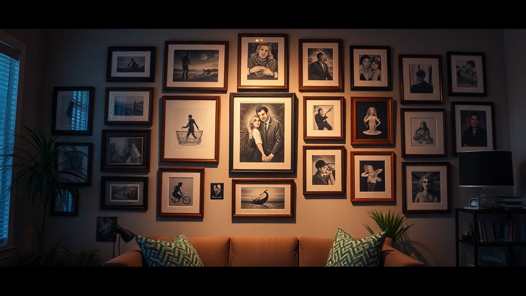
The Frame Strategy: Don't look for the art; look for the frames. You can find high-quality, heavy wood or ornate vintage frames for a few dollars at local thrift shops. Even if the art inside is hideous, you can replace it. If you find a frame with a great structure but a terrible color, don't panic. A quick coat of matte black or gold spray paint can transform a $2,000 look into a $5 look.
Sourcing Art for Cheap:
- Public Domain Archives: Websites like the Smithsonian or the Met offer thousands of high-resolution, public domain images. You can download a vintage botanical print or a classical landscape for free, print it at a local print shop, and frame it.
- The "Art" of the Mundane: Sometimes the best art isn't "art" at all. An old map, a vintage recipe card, or even a beautifully textured piece of fabric can be framed to add depth to your space.
- Personal Archives: That grainy photo of your grandmother or a cool postcard from a trip? Frame it. Personal history adds a layer of warmth that a mass-produced print never will.
Step 3: Layout and Planning (The "Don't Ruin Your Walls" Phase)
This is where most people fail. They start hanging things one by one, realize halfway through that the spacing is uneven, and end up with a crooked mess. Or, worse, they hammer fifteen holes into a rental wall and lose their security deposit.
First, let's address the elephant in the room: the rental struggle. If you are worried about the permanent damage of nails, you should definitely look into how to style a rental-friendly gallery wall without nails. However, if you have permission to use small nails, the following layout method is the gold standard for a professional look.
The Floor Method
Before anything goes on the wall, lay your entire collection out on the floor. This is your "sandbox" mode. Move pieces around, swap sizes, and adjust the spacing.
The Golden Rules of Layout:
- The Anchor Piece: Start with your largest, most visually heavy piece. This is your "anchor." It doesn't have to be in the dead center, but it should be the focal point around which everything else revolves.
- Consistent Spacing: Aim for a consistent gap between frames—usually between 2 to 3 inches. If the gaps are wildly different, the wall will look unintentional.
- The Eye-Level Rule: The center of your gallery wall (or the center of your anchor piece) should be roughly at eye level. A common mistake is hanging art too high, which makes the room feel disconnected.
The Paper Template Trick
Once you love your floor layout, don't just pick up the frames and start hammering. Take some cheap brown butcher paper or even old newspaper and trace each frame. Cut out the shapes. Now, use painter's tape to stick these paper templates onto your wall. This allows you to see exactly how the scale looks against your furniture and lighting without making a single hole. It’s the ultimate way to use Command Hooks effectively or test nail placements without the stress.
Step 4: Installation and Final Touches
Now that you have your templates taped to the wall, it’s time to execute. If you are using nails, make sure you are hitting a stud if the frame is particularly heavy. If you are using adhesive strips, ensure the wall is clean and free of dust first, or they *will* fall off in the middle of the night.
Once the frames are up, take a step back. A lot of steps back. Walk into the other room, come back, and look at it with fresh eyes. Does one piece feel too "loud"? Does the spacing feel cramped? Adjust as needed.
Lighting is the Secret Weapon:
A gallery wall without proper lighting is just a bunch of pictures on a wall. To make it look like a curated exhibition, consider adding light. You can use battery-operated picture lights that clip onto the top of frames, or even small LED spotlights. If you’re looking to create a more immersive atmosphere in your living area, you might also enjoy learning about creating a moon garden for your outdoor space, as the principles of nighttime lighting and ambiance are surprisingly similar.
Summary Checklist for Success
To ensure you don't end up with a "Pinterest Fail," keep this checklist nearby:
- Pick a cohesive theme (Color, subject, or frame style).
- Thrift your frames (Don't buy new; look for quality bones).
- Download high-res art (Use public domain archives for free, high-quality prints).
- Layout on the floor first (Test your anchor piece and spacing).
- Use paper templates (Avoid the "oops, I hung it too high" mistake).
- Check your rental rules (Use non-damaging solutions if you're on a tight lease).
Creating a beautiful home shouldn't require a massive inheritance or a professional interior designer. It requires a bit of patience, a little bit of grit, and the willingness to look through the "junk" to find the gems. Now go forth and turn that beige wall into something you actually want to look at.
Steps
- 1
Gather Your Art and Frames
- 2
Create a Layout on the Floor
- 3
Trace and Mark Your Wall
- 4
Hang Your Frames Securely